

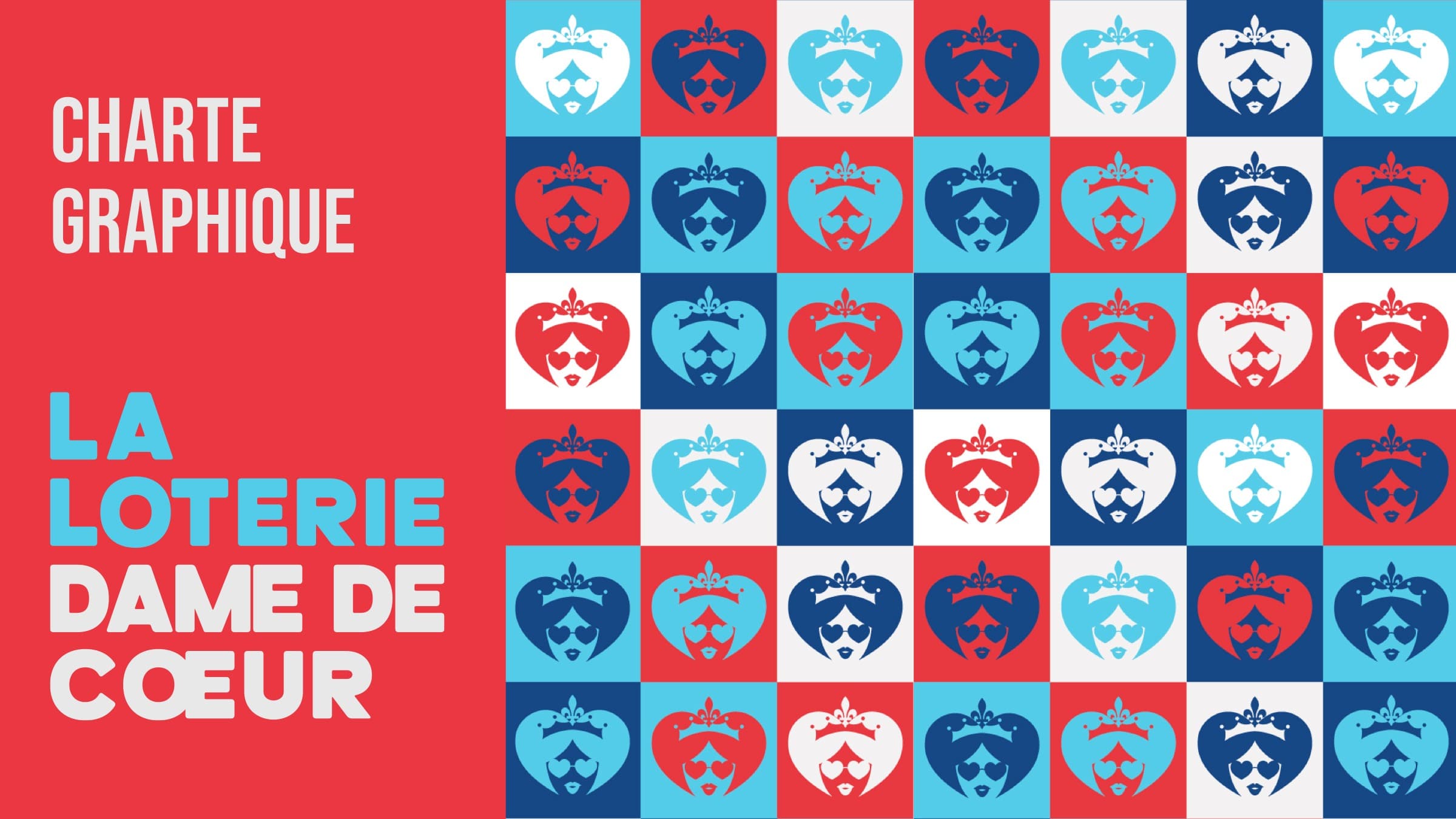
A complete brand system for a charity lottery: a custom playing-card cast of characters, a mark that works from a bus wrap to an Instagram tile, and a campaign that had to read instantly to strangers on the street.
La Loterie Dame de Coeur
Gallery
Challenge
A charity lottery competing for attention against every other cause and every other draw. The brand needed a mark and a cast of characters distinctive enough to be recognized from a moving bus, and warm enough to be trusted with a donation.
Strategy
Build the identity around a single, ownable idea, the queen of hearts, and let a full suit of illustrated queens carry the brand's personality across every touchpoint, from the logo down to a single Instagram tile.
Creative Direction
An illustrated cast (hearts, diamonds, clubs, spades) gave the brand a visual language that didn't rely on generic lottery iconography: gold coins, confetti, dollar signs. The queen of hearts became the flagship mark; the other three queens extended the world without diluting it.
Design System
Three logo lockups (horizontal, vertical, square) built for OOH, digital, and print at wildly different scales, plus a documented brand guideline set delivered as a full reference PDF for the client's internal and agency use.
Execution
The system shipped across a citylight/bus-stop placement, a full bus wrap, a website, and Facebook/Instagram brand pages, each adapted to its format rather than a shrunk-down copy of the last.
Impact
Add real campaign results here (reach, donation volume, brand recall) once available.
Lessons
Character-driven identity work has to survive contact with the least controlled medium first (here, a moving bus at street level); everything else gets easier once that constraint is solved.